happy day
Published: Thursday, December 25, 2008
Big news around here, other than the snowpocalypse, is casa rakkaleff's new guestbook. The mustache guestbook. It's a silly idea whose time has come. It looks a little something like this:
some lqa buildings [architecture sunday]
It's been a while since I did any architecture posts. So here are a couple of buildings near my house that I've always kind of liked.
The Delphian is a bit run down these days, and I can't imagine that it's super fun to live in. But I can't help liking it. I mean, it's blue. From the street it's a big blue box. What's not to like?
Here it is sans snow.
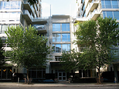
And right next door is this mid century thing. The balconies seem kind of cheery somehow. But what I really like is the entry way. Don't know why. Just do. It's a nice shape.
And again, sans snow. (golly, I like technology)
magician's bane (the final countdown)
Published: Sunday, December 14, 2008
Eventually, we found Mary and Daniel and hatched a plan. The karaoke machine had "the final countdown" on it. The magician was gone by the time we were done. I have no idea why.
Redfin uses google maps now! Rock!
Published: Thursday, December 11, 2008
Our CTO, Mike Young, has a good explanation of the reasons (in short, contracts and speed. It is so fast. Btw, we don't officially support Google Chrome yet, but hoo boy does display the map fast).
According to Sasha Aickin (Search team lead), it was surprisingly easy to get working. Of course Sasha and his team are a bunch of geniuses, so it didn't surprise me.
counterbalance disco
Published: Saturday, December 06, 2008
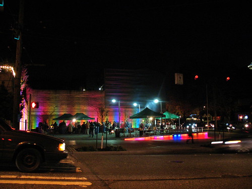
They're pretty cool. I like them. I think the new ones needs some adjustment on the timing though. They're a little tweaky.
Here they are in context:
why is life so hard?
Published: Friday, November 28, 2008
Search for "computer desk" anywhere and you'll find pages and pages of tables, sometimes with a keyboard tray. These are not computer desks. I put it to you, how can it be a "computer desk" if it doesn't have cable management? You gonna spend hundreds of dollars on a desk to still be faced with cable spaghetti?
I also wonder why they have to be so ugly.
Does it really come down to choosing between form and function? Do I spring for some knoll to get something that kinda works, but makes the pad feel like a cube farm? Is that all there is?
carbonado, wa
Published: Sunday, November 16, 2008
Went up to Carbonado this weekend with my friend Brent and his friend Doug, met a bunch their friends up there, then slogged through the mud to find this ghost town.
It was a town, called Melmont. The ghost town label is a bit of stretch though. That implies some standing buildings and stuff.
What we found were the ruins of Melmont. They consisted of a rock wall that may or may not have been part of a building, the ruins of a dynamite store house, and the ruins of the one room school. Each separated by a quarter mile slog down a very muddy trail.
Still, it was a bunch of fun. An Adventure, you know? There's a ton more pictures on flickr.
importing contacts
Published: Saturday, November 08, 2008
yes, I'm voting for Obama, now STOP CALLING ME
Published: Sunday, November 02, 2008 ( 1 comment )
I couldn't be happier to vote for Obama. But seriously, enough with the calls. The count is up in the thousands now. At least two phone bank calls reminding me to vote, a robocall from Michele and at least one from every dem candidate in the state. Including "special commissioner for the appreciation of billiards" for all I know; I've kind of stopped paying attention.
it's been a weird couple of weeks
Published: Thursday, October 16, 2008
It's very relieving to be on this side of it, but there's no joy. More than any other job I've had I really like the people at Redfin. All of them. They are why I ignore all the recruitment messages that plague me on every social network. They are why I forget to blog for weeks at a time. They are why I work so hard.
So to have 20% of them gone. It's difficult. I miss them.
“To those who left, I can only say thank you for all that you’ve done for Redfin, and I’m sorry. It wasn’t your fault that you had to leave, and we will do what we can to help you take your next step. We’ll miss you, and we wish you the best of luck.”Glenn said that, in the blog post. I second it. Seriously, anything you guys need.
delicious library sale
Published: Sunday, September 28, 2008
One of the things that happens a lot is I go there, and come back with twenty books that I already have. This year I had help. It starts with actually inventorying all the books I actually have. A pain in the ass that was lessened a bit by delicious monster's library.
It has a lot of cool features. Like isight barcode scanning that looks your stuff up on amazon and fills in the details for you. It keeps track of loans. And most importantly for the library sale, ipod export.
It sticks a note in your ipod notes directory for each of your things. It even includes a snapshot of your 'smart shelves'. So while you're being jostled around by a crush of bookfans and trying to remember if you own "Cause of Death" or you just read it from the library, you can look it up. (And without lugging your computer around, or having to find a printer)
So, delicious library is pretty useful. It's not the best thing ever though. It is buggy; I didn't mention the web export feature because it crashes the program for me (I suspect Japanese characters are the problem).
The worst thing about it though, is its tendency to make the wrong assumption when scanning old barcodes. Every week it picks a new movie to default to import when it can't find the book I'm looking for (this week, a best of Victor Borge vhs, last week it was something about Marilyn Monroe). To mitigate this a bit, you can make it speak the results (using the default mac os x voice), so you can move on to something else and it will tell you if it found the right thing.
Another bad thing. The UI for picking the exact edition you have, when you have to search by hand, is terrible. You type in "Murder Most Foul" and it shows you 50 titles, dates and covers (mostly blank). No option to search further. You can get more details, but it opens up an amazon window in your browser, which I don't want to do 50 times per book. My feature request was met with (paraphrasing) "we have to make the software more stable first; we'll think about that later". Not very encouraging for software that I actually paid for.
Update
If I had checked my mail before writing this post, I would have found a patch waiting for me for the web export (to folder) bug that I mentioned earlier. Which I just tried and it works.
I only filed the bug report this weekend. Quick work guys! Thanks! (Can we talk features now *grins*)
err... wamu tower? [architecture friday]
Washington Mutual Tower screams 'eighties'. Which, despite the fashion industry's success at selling it to the young'uns, I consider to be a bad thing. The eighties were ugly when I lived through them. They still are. Evidence:
There are a couple nice bits. The trees in the courtyard are nice. The art, if you wish to call it that... well, I'm embarrassed for them.
The little lights on the side are nice. Wish they were on some other building.
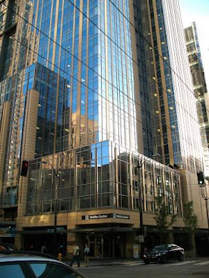
Right on the next block is WaMu center. It's much better. I actually quite like it. It's all boxy and blue and shiny. Ground level is kind of ugly, but as soon as you get to the second story: sweet.
And from a distance it's this nice big blue monolith. It stands away from other buildings just a bit, which makes it even prettier.
WaMu Center, FTW!
queen anne ugly [architecture friday]
I should just call this section architecture sunday. I'm such a slacker.
Anyway, there was a little controversy when I called Gallery a "crap shack". I think maybe I did go too far.
Gallery is just sort of plain. These these "condos" are pretty much the dictionary definition of "crap shack". They are a blight. They stain my neighborhood. Ugh. I can't even look at it.
Here, it's something soothing from the archives to take our minds off of it.
pbs kinda sucks, go fix it
Published: Thursday, September 18, 2008
The 30 something demographic makes an attractive target audience... I'm just saying.
Readers, go forth and apply!
* Ok, not really. I'm happy at Redfin.
last.fm recommendations are too good now
Published: Monday, September 15, 2008 ( 4 comments )
 Specifically, I'm talking about the recommendations. They used to stink, like the blues brothers. I mean they smell[ed] bad. I'm talking 0% hit rate.
But lately they've been getting better and better. In fact, I've gone from not looking at the recommendations, to trying not to look at the recommendations. They cost too much. I just casually dropped 40 bucks at the amazon mp3 store without even really realizing it.
 That's probably half the problem, right there. The amazon mp3 store is just too nice. It's cheaper and DRM freer (ie, no DRM) than itunes. Its "stupid" downloader, that I'm sure I complained about somewhere, is actually smooth and easy. It puts the files right in itunes so you don't have to. It's literally one click (if you set it up like that) and the songs are on your player.
It's so dead easy that websites with big brown pirate ships on the front are starting to be my second choice. I'll totally pay to not have to search, and search, and wait, and hope, and wait, and wait, and oh, the seeders must have gone off line... Yeah, 9 bucks and 5 minutes seems like the thing.
the klee [architecture friday]
Things I like about it:
- It has it's own website.
- The look of the big metal box on the low-rise side.
Other than that, it really looks rather stark and utilitarian. Their web page says the low-rise side has big windows, but it doesn't look like it to me. Maybe all that aluminum is messing with my perspective, but I can't help but think of those fortress schools that they build in the 90s. You know, the ones with one arrow slit window per floor.
The high-rise side is just generic.
I kind of think I don't like it, overall, even though I really like certain elements. But, it could be that I just don't like the logo, and I'm appling that to the whole building. Seriously, it looks like some wannabe high end food product.
Maybe I'm shallow. I don't know. But I just can't get behind a logo like that.
Hard-Boiled Wonderland and the End of the World
Published: Wednesday, September 10, 2008 ( 8 comments )
It started slow, and it was obvious from the first that the two plot lines were about the same guy. Neither of them were particularly interesting; the one was actually sort of painful.
Eventually I managed to eek a little interest in how the plots were going to meet up, but then it became clear that it was going to end stupid. Which it did. It kind of made me angry, really. Now I'm rather disinclined to read any of the others. Maybe I'll give him a rest and try again later.
marlborough building [architecture friday]
But, enough of that. Architecture is the word of the day. I was in first hill today and ran across the Marlborough building. It's pretty.
I got a little excited when the sign said that had some extremely affordable units. But $257,000 is still expensive for 523 square feet. Unfortunately, you don't get a discount for buying in bulk. Why does price per square foot go up with square feet? This is completely contrary to my experience with buying things. Groceries and houses are basically the same, right?
Maybe not. Anyway, the marlborough is pretty. Somebody should totally live there and tell me how great the inside is.
Oh, and since this post is so late, I'll include some bonus photos from my flickr stream (it's like I'm navigating the web for you; see how nice I am!)
Matter
Published: Sunday, August 31, 2008
It gets sort of philosophical in the middle, but rather than pulling that into an overarching theme Banks just drops it, seemingly in favor of rattling off the last of the plot. The characters are developed just in time to get killed off. The plots and stratagems that the characters involve themselves in seem rather pointless in the end.
Hmmm. Maybe that is the point. Or it could be that I didn't develop any affinity for the characters. Not really.
There is some fun to be had with the giant habitats and stuff. Manufactured worlds, that sort of thing. Overall, though, it's probably my least favorite Culture novel.
concord building [architecture friday]
Now, to the business of the day: making fun of buildings even though I sort of like them. Specifically, the Concord in Belltown. It makes me laugh because it's named after a rather famous jet, and it looks like an airport terminal.
It makes me think of an architect that really wanted to be the Seatac guy but didn't get the contract, so he repurposed the plans. I'm sure it wasn't like that, but the thought amuses me anyway*. Here, let's take a closer look at the awning.
Do you not expect to see sky caps standing around under this awning? Whenever I walk by I worry that I don't have my tickets.
But as much as it amuses me, I like this building. I mean, it looks like an airport, how cool is that?
It's not perfect. Not my dream condo block or anything. I take specific issue with the 80sesque fountains out the front. And the fact that I can't afford them. Oh well.
* (For the curious, it was in reality made by Driscoll Architects, who have done other stuff in town and have a broken website).
chasm city
Published: Monday, August 25, 2008
It's one of those books where things are not what they seem, but you figure it out about 200 pages before any of the characters do. They mystery is more along the lines of 'when is this dude gonna figure this stuff out? come on! I know I'm right. right?'
But still, it's an amusing little romp if you like space ships, transhumanism and squalor.
2nd ave crap shack [architecture friday]
I know it's not done yet. I know. That makes it worse. The architects have had a chance to see boring condo buildings just like this one all over town for years and years, and yet they make another one. It's like they're just in it for the money or something.
I know that not every building can be ground breakingly unique. But can't we have more than one style at a time? Does all new construction have to be exactly the same?
werewolves, and vampires in space
Published: Tuesday, August 19, 2008
First up was Lonely Werewolf Girl, which I liked. It's a bit silly, but at the same time, it has more depth than you'd expect. I'm not saying it's great literature, but there's actually character development, etc. It's not all werewolf fashion designers and fire elemental social events. Though there is a lot of that. On the surface it's pretty girly actually; just roll with it, you'll be fine.
Blindsight is a very different book. It's hard science fiction, to the point that there are pages of references in the appendix. Ostensibly it's about first contact with an alien race. Really it's about the nature and usefulness of sentience. It's conclusions are... depressing. Still, it's one of the few books I've read recently that made me think a bit, so I'll recommend it too. Don't be put of by the vampire thing; it makes sense in context.
Some buildings in Portland [architecture friday]
There is some good stuff in Portland for a steel and glass fetishist like myself, but mostly it's historic buildings and parks. Those are good to, I admit.
My favorite building was this tall thing with what looked like green marble all the way up. But I didn't get a chance to see it up close; could have been faux marble.
Here's one for all my dead homies. (Yes, Portland's city planners from the early 1900s are my homies)
Did you know you can buy rugs at every street corner in Portland? Well, this corner.
And to think, somebody once thought this place was non-ironically cool. Personally, I think it's ironically awesome!
And that's my whirlwind tour of Portland. Next week it's back to boring you with Seattle buildings. Woot!
portland, oregon
Published: Monday, August 04, 2008
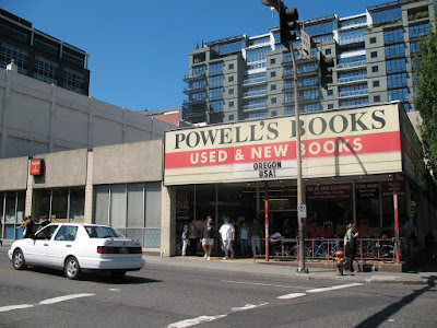
Since it was my first time to Portland, it was my first time at Powell's. QED. Powell's had a lot of books, but I was surprised at how few of them interested me. Maybe it was the crowds. It was busier than anybody had ever seen it. Or maybe it was that the fantasy was mixed in with the sci-fi. I hate that.
Overall, Portland is pretty quaint. It felt like a clean Memphis or Baltimore. Nice place to visit.
I didn't get a chance to see the Japanese Gardens, and there was a neighborhood up on a hill that looked pretty neat. If/when I make it back, I'll have to go exploring more.
The retro arcade near Powell's was pretty awesome.
Rainier Tower [architecture friday]
I've loved this building forever. I posted some warped pano of it ages ago, somewhere. I'm damned if I can remember where. Anyway, 40 stories tall, but 11 are taken up with the riser, leaving only 29 usable floors. It's crazy. Crazy good!
It looks pretty fantastical from a distance. But it can be 'more fantastical', to quote space ghost. Up close it's pretty damn crazy. There's a 29 story office building hanging in space right over your head. You can get reverse-vertigo, a thing I just made up, if you're not careful.

entrance
(Off to the right, from this picture is the entrance to a Rock Bottom. It's a chain of mall restaurants, like upscale TGI Fridays, that I'm happy to say I've never visited. Rest assured, you won't see the food blog polluted by it.)
The entrance is only slightly gaudy. It's nice that the architect (the WTC-NY guy apparently) understood that 11 stories worth of pedestal forestalls the need for sparkly entrances.
There are a lot of nice angles; well, four.
leff got a bonus
Published: Thursday, July 31, 2008 ( 3 comments )
The end of the quarter is upon us. Actually, it's well past. But bonus checks post this week. So I converted all that crunch time hard work into a time sink.
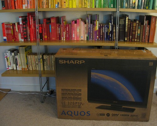
xbox looks pretty awesome on this dowhoppy. It has special 'game ports' that don't do the goofy filtering stuff that these new fangled tv's so love to do. So maybe I'll replay bioshock. It'll look so purty.


