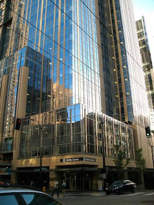
[where: 1201 Third Ave., seattle, wa]
Washington Mutual Tower screams 'eighties'. Which, despite the fashion industry's success at selling it to the young'uns, I consider to be a bad thing. The eighties were ugly when I lived through them. They still are. Evidence:
There are a couple nice bits. The trees in the courtyard are nice. The art, if you wish to call it that... well, I'm embarrassed for them.
The little lights on the side are nice. Wish they were on some other building.
Right on the next block is WaMu center. It's much better. I actually quite like it. It's all boxy and blue and shiny. Ground level is kind of ugly, but as soon as you get to the second story: sweet.
And from a distance it's this nice big blue monolith. It stands away from other buildings just a bit, which makes it even prettier.
WaMu Center, FTW!


1 comment:
I utterly agree that the WaMu Tower is a miserable piece of 1980s Post Modern crap.
I also agree that the WaMu center is a great building. Of all the downtown highrises, it's my favorite. It's unabashedly a rectangle, but contains subtle features that viewed from a distance give it a sail-like appearance.
Post a Comment