delicious library sale
Published: Sunday, September 28, 2008
One of the things that happens a lot is I go there, and come back with twenty books that I already have. This year I had help. It starts with actually inventorying all the books I actually have. A pain in the ass that was lessened a bit by delicious monster's library.
It has a lot of cool features. Like isight barcode scanning that looks your stuff up on amazon and fills in the details for you. It keeps track of loans. And most importantly for the library sale, ipod export.
It sticks a note in your ipod notes directory for each of your things. It even includes a snapshot of your 'smart shelves'. So while you're being jostled around by a crush of bookfans and trying to remember if you own "Cause of Death" or you just read it from the library, you can look it up. (And without lugging your computer around, or having to find a printer)
So, delicious library is pretty useful. It's not the best thing ever though. It is buggy; I didn't mention the web export feature because it crashes the program for me (I suspect Japanese characters are the problem).
The worst thing about it though, is its tendency to make the wrong assumption when scanning old barcodes. Every week it picks a new movie to default to import when it can't find the book I'm looking for (this week, a best of Victor Borge vhs, last week it was something about Marilyn Monroe). To mitigate this a bit, you can make it speak the results (using the default mac os x voice), so you can move on to something else and it will tell you if it found the right thing.
Another bad thing. The UI for picking the exact edition you have, when you have to search by hand, is terrible. You type in "Murder Most Foul" and it shows you 50 titles, dates and covers (mostly blank). No option to search further. You can get more details, but it opens up an amazon window in your browser, which I don't want to do 50 times per book. My feature request was met with (paraphrasing) "we have to make the software more stable first; we'll think about that later". Not very encouraging for software that I actually paid for.
Update
If I had checked my mail before writing this post, I would have found a patch waiting for me for the web export (to folder) bug that I mentioned earlier. Which I just tried and it works.
I only filed the bug report this weekend. Quick work guys! Thanks! (Can we talk features now *grins*)
err... wamu tower? [architecture friday]
Washington Mutual Tower screams 'eighties'. Which, despite the fashion industry's success at selling it to the young'uns, I consider to be a bad thing. The eighties were ugly when I lived through them. They still are. Evidence:
There are a couple nice bits. The trees in the courtyard are nice. The art, if you wish to call it that... well, I'm embarrassed for them.
The little lights on the side are nice. Wish they were on some other building.
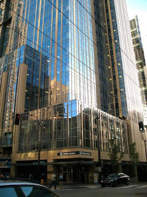
Right on the next block is WaMu center. It's much better. I actually quite like it. It's all boxy and blue and shiny. Ground level is kind of ugly, but as soon as you get to the second story: sweet.
And from a distance it's this nice big blue monolith. It stands away from other buildings just a bit, which makes it even prettier.
WaMu Center, FTW!
queen anne ugly [architecture friday]
I should just call this section architecture sunday. I'm such a slacker.
Anyway, there was a little controversy when I called Gallery a "crap shack". I think maybe I did go too far.
Gallery is just sort of plain. These these "condos" are pretty much the dictionary definition of "crap shack". They are a blight. They stain my neighborhood. Ugh. I can't even look at it.
Here, it's something soothing from the archives to take our minds off of it.
pbs kinda sucks, go fix it
Published: Thursday, September 18, 2008
The 30 something demographic makes an attractive target audience... I'm just saying.
Readers, go forth and apply!
* Ok, not really. I'm happy at Redfin.
last.fm recommendations are too good now
Published: Monday, September 15, 2008 ( 4 comments )
 Specifically, I'm talking about the recommendations. They used to stink, like the blues brothers. I mean they smell[ed] bad. I'm talking 0% hit rate.
But lately they've been getting better and better. In fact, I've gone from not looking at the recommendations, to trying not to look at the recommendations. They cost too much. I just casually dropped 40 bucks at the amazon mp3 store without even really realizing it.
 That's probably half the problem, right there. The amazon mp3 store is just too nice. It's cheaper and DRM freer (ie, no DRM) than itunes. Its "stupid" downloader, that I'm sure I complained about somewhere, is actually smooth and easy. It puts the files right in itunes so you don't have to. It's literally one click (if you set it up like that) and the songs are on your player.
It's so dead easy that websites with big brown pirate ships on the front are starting to be my second choice. I'll totally pay to not have to search, and search, and wait, and hope, and wait, and wait, and oh, the seeders must have gone off line... Yeah, 9 bucks and 5 minutes seems like the thing.
the klee [architecture friday]
Things I like about it:
- It has it's own website.
- The look of the big metal box on the low-rise side.
Other than that, it really looks rather stark and utilitarian. Their web page says the low-rise side has big windows, but it doesn't look like it to me. Maybe all that aluminum is messing with my perspective, but I can't help but think of those fortress schools that they build in the 90s. You know, the ones with one arrow slit window per floor.
The high-rise side is just generic.
I kind of think I don't like it, overall, even though I really like certain elements. But, it could be that I just don't like the logo, and I'm appling that to the whole building. Seriously, it looks like some wannabe high end food product.
Maybe I'm shallow. I don't know. But I just can't get behind a logo like that.
Hard-Boiled Wonderland and the End of the World
Published: Wednesday, September 10, 2008 ( 8 comments )
It started slow, and it was obvious from the first that the two plot lines were about the same guy. Neither of them were particularly interesting; the one was actually sort of painful.
Eventually I managed to eek a little interest in how the plots were going to meet up, but then it became clear that it was going to end stupid. Which it did. It kind of made me angry, really. Now I'm rather disinclined to read any of the others. Maybe I'll give him a rest and try again later.
marlborough building [architecture friday]
But, enough of that. Architecture is the word of the day. I was in first hill today and ran across the Marlborough building. It's pretty.
I got a little excited when the sign said that had some extremely affordable units. But $257,000 is still expensive for 523 square feet. Unfortunately, you don't get a discount for buying in bulk. Why does price per square foot go up with square feet? This is completely contrary to my experience with buying things. Groceries and houses are basically the same, right?
Maybe not. Anyway, the marlborough is pretty. Somebody should totally live there and tell me how great the inside is.
Oh, and since this post is so late, I'll include some bonus photos from my flickr stream (it's like I'm navigating the web for you; see how nice I am!)


